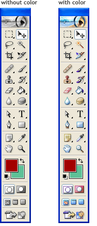
 Currently, in all Adobe products I’ve used (Photoshop CS, Illustrator 10, Elements 3.0) the tool palettes are black and white *until* the mouse pointer is over them.
My suggestion is to *always* show color for the tool buttons. This aids in target acquisition because color provides yet another cue in addition to shape and button location. In other words, with color, it’s a heck of a lot easier to pick out the eraser tool when coming from all the way on the other side of the screen, than when it’s black and white. Especially since there are other “rectangular” looking images in the tool palette.
The other benefit is you would avoid any confusion novice users may have distinguishing black and white buttons and disabled buttons.
I remember when Microsoft introduced the “coolbar” widget (used in various flavors of IE from Win95 to Windows 2000) so that IE’s toolbar buttons were monochromatic. What a usability mistake! This made discerning between the buttons much more difficult, especially for a product with such a high frequency of clicking back and forth between the content area and the toolbar (it didn’t help that the coolbar button’s disabled state was very similar to its enabled state!).
Icons are small, pictorial representations of a concept or an object. Sometimes color is an important attribute of that representation. Like the red in a “Stop” button or the yellow of a “Pencil”, these colors are important cues that aid in recognition (what does the icon represent?) as well as help discernment (singling out the icon from a palette of 31 other images).
I can understand how graphic professionals who use a program 12hrs/day, 7days/week do not need help with icon recognition or discernment. They probably have all the tool button positions ingrained in their reflexes. (But, then again, wouldn’t those users use keyboard shortcuts instead? Why heck, they should just hide the tool palette and gain more real estate!)
Does color detract from the content of a graphical application like Photoshop? Maybe, if implemented in a gaudy manner. But with that argument, then it’s not just the tool palette that’s the problem. With that philosophy, then *everything* other than the content area should be monochromatic. From the taskbar to the desktop icons and to any other application window visible in the background, they should *all* be colorless.
To clarify my original point, I’m not suggesting adding color just for color’s sake, but that the proper use of subtle color does provide benefits that outweigh any costs. If it didn’t, we’d all still be using monochrome displays. I don’t have to conduct a comparative usability study with 50 users on color and monochromatic versions of a product (counterbalanced for order, of course), to conclude that adding red to the *Red* Eye tool would decrease task time and error rates.
BTW, Adobe does break their own rules. In Acrobat and Photoshop Elements, the toolbars use color.