 After my recent failed attempts at VO2 intervals, I decided to take today completely off. Instead, I spent most of the day making improvements to my homegrown training diary. I created the first version years ago so that Heather and I could log our workouts along with other relevant stats (resting HR, weight, etc.). We each use one spreadsheet per season and I usually improve upon it every fall when I redo them for the next year. Over time, it has evolved into a pretty sophisticated application!
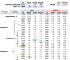
 In addition to tracking workout detail and daily info, I’ve got macros that extract critical powers (CPs) from a PowerTap file. There’s a worksheet that compares those CPs to prior seasons. There’s a power profiling table that uses conditional formatting to rank my mediocre abilities against pro cyclists. Basically, it’s a full-featured training diary. But the one thing it didn’t have until now was a Performance Management Chart (PMC). So today I finally got the PMC integrated into my Excel-based diary.
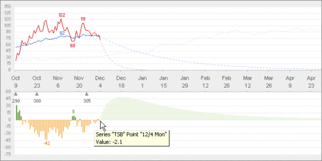
If you’re familiar with the PMC in CyclingPeaks, you’ll notice that I pulled out training stress balance (TSB) from the acute and chronic training load (ATL/CTL) chart. Separating them allowed me to optimize each chart for their intended purpose. For example, when analyzing TSB, you’re looking for positive versus negative values. A bar chart using different colors works very well. In the training load chart, you want to compare ATL/CTL trends, so a line chart works best. I was afraid that splitting them up would take up too much real estate, but since each chart is now simpler, I was able to size them down and fit them within a similar amount of space. I also arranged them so they are aligned to share the same X-axis; another space-saving technique.
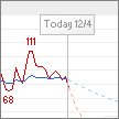
 For the ATL/CTL chart, I figured out a way in Excel to graph the lines so that future values display differently than past values. This was a little tricky, but the free-form nature of a spreadsheet allowed me to add some columns that gave me the data I needed to graph them this way (hint: each line really consists of two series!). Then I realized I could do a similar thing for the TSB bar chart by using faded colors for future values. My original idea was to overlay a chart that showed a callout and a thin vertical line for Today(), but the “fade” solution accomplishes the same goal without adding visual noise.
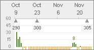
The other thing that was kind of tricky was showing my functional threshold power (FTP) set-points. Since TSS is based on FTP, (thus so is ATL, CTL, and TSB) I thought it would be useful to show my FTP along the time-line. Whenever I do a test or deduce my FTP has changed, I just enter it on the “Daily” page of my diary, then it automatically shows up in the chart. A side benefit is that I can see the progression (or regression) of FTP scores. As you can see, I’m kind of in a rut…only increasing five watts since a month ago!
Another thing I did was add my 2006 CTL to the training load chart. I added it as such a faint line that you may hardly notice it! That’s because I didn’t want to detract from the current season’s data; I just wanted it there for reference. The last thing I did was to display a few value labels for some points of interest, like the peaks and valleys of my ATL. This is the only part of my chart that’s manual; I actually have to right-click the data point and turn-on the label for it. But since I won’t be doing this often, I didn’t see the need to automate it (but after learning the “multiple series” trick, I have an idea on how to do it if I had to). Right now, I’m happy with the way the Excel-based PMC ended up, but I’m sure I’ll have a few tweaks as I use it on a daily basis!